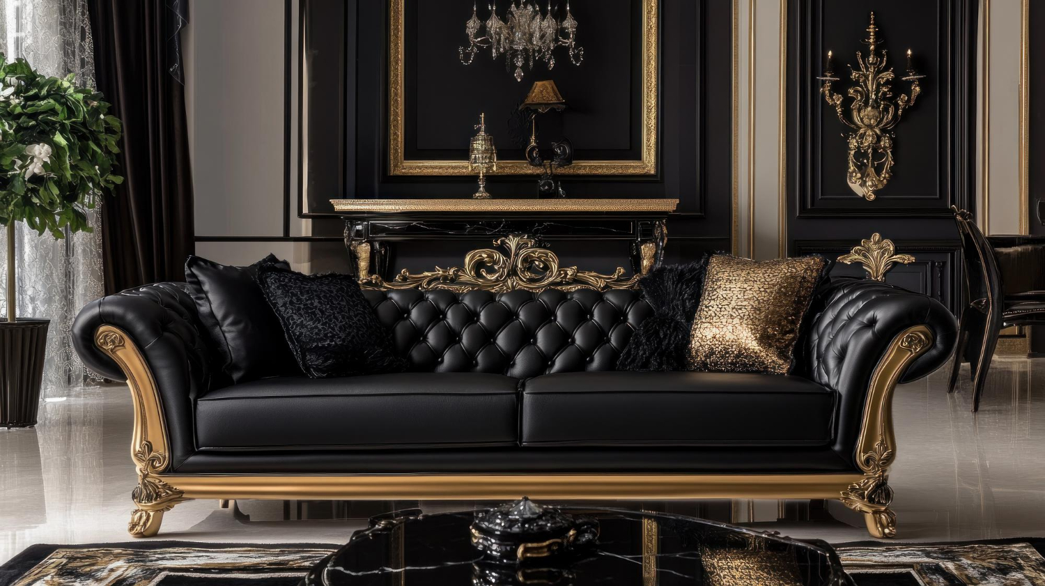
Black Lacquer & Gold: The Modern, High-Contrast Baroque Furniture Look
The Baroque period, a time of artistic and architectural flourishing across Europe, is being radically redefined by avant-garde European designers. Moving beyond traditional wood stains and velvet drapes, a striking new trend has emerged: the marriage of classic baroque furniture silhouettes with bold, high-gloss black lacquer and crisp gold accents.
This dramatic aesthetic is not a rejection of heritage; it is a powerful stylistic reinterpretation. It allows designers to inject the extravagance of the 17th century into the sleek lines of contemporary luxury living, creating interiors defined by unapologetic, high-contrast interior design.
Styling Innovation: The Power of Monochromatic Drama
The use of black lacquer on traditionally carved baroque furniture instantly modernizes the piece, transforming it from a historical relic into an editorial-worthy statement. The deep, reflective black eliminates the visual softness of wood grain, emphasizing only the sculptural form and the play of light.
- Sculptural Focus: A black lacquered commode, for instance, allows the intricate curves and volutes to stand out sharply against a lighter wall. This stark contrast turns the piece into a piece of high-contrast interior design art, perfect for luxury apartments and living places.
- The Gold Ratio: The gold element—ideally applied via authentic gold leaf—is essential. It is typically reserved for the ornamental carvings, the feet, or the drawer pulls. The small surface area of the gold is amplified by the intense black backdrop, delivering maximum impact with minimal application on the baroque furniture. This ensures the opulence remains refined, not overwhelming.
Achieving Editorial-Worthy High Contrast
For luxury homeowners and investors in baroque furniture, achieving this refined, dramatic look involves more than just selecting the right colour. It’s about materiality and texture, which elevates the piece to true high-contrast interior design.
1. The Finish: Gloss vs. Matte
The choice of lacquer finish determines the atmosphere. A high-gloss black reflects light brilliantly, enhancing the drama and adding a distinctly modern, polished edge. A satin or matte black provides a deeper, quieter sophistication, making the room feel more grounded. Both, however, serve as the perfect foil for gold in achieving the modern Baroque aesthetic.
2. Upholstery for Impact
For seating (such as a black and gold occasional chair or sofa), the upholstery should complement the stark contrast. Consider deep, plush black velvet, which absorbs light, or a crisp white linen or ivory leather. These materials enhance the high-contrast interior design theme and provide a sensual texture against the hard lacquer and gold of the baroque furniture. When used in a luxury apartment, the combination speaks volumes about the owner’s sophisticated taste.
By embracing this bold palette and applying precision in materials, designers are proving that baroque furniture is not bound by history, but is an evolving canvas for sophisticated, contemporary expressions of luxury.