In the competitive landscape of European high-end hospitality, a hotel is no longer just a place to rest; it is a curated sensory experience. Designers are increasingly moving away from the sterile minimalism of the last decade, favoring “maximalist elegance” that tells a story of heritage and grandeur. At the heart of this aesthetic revival is a single, transformative element: the Baroque style mirror.
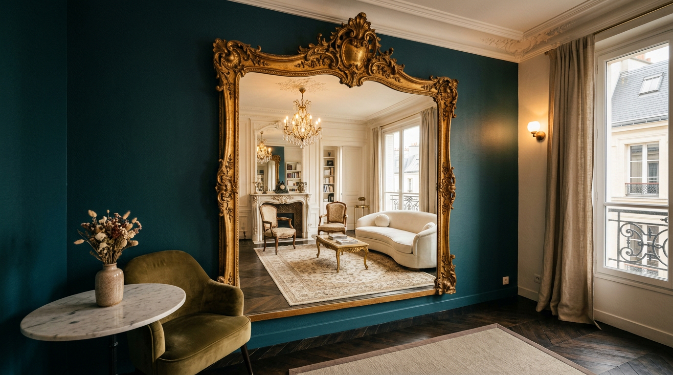
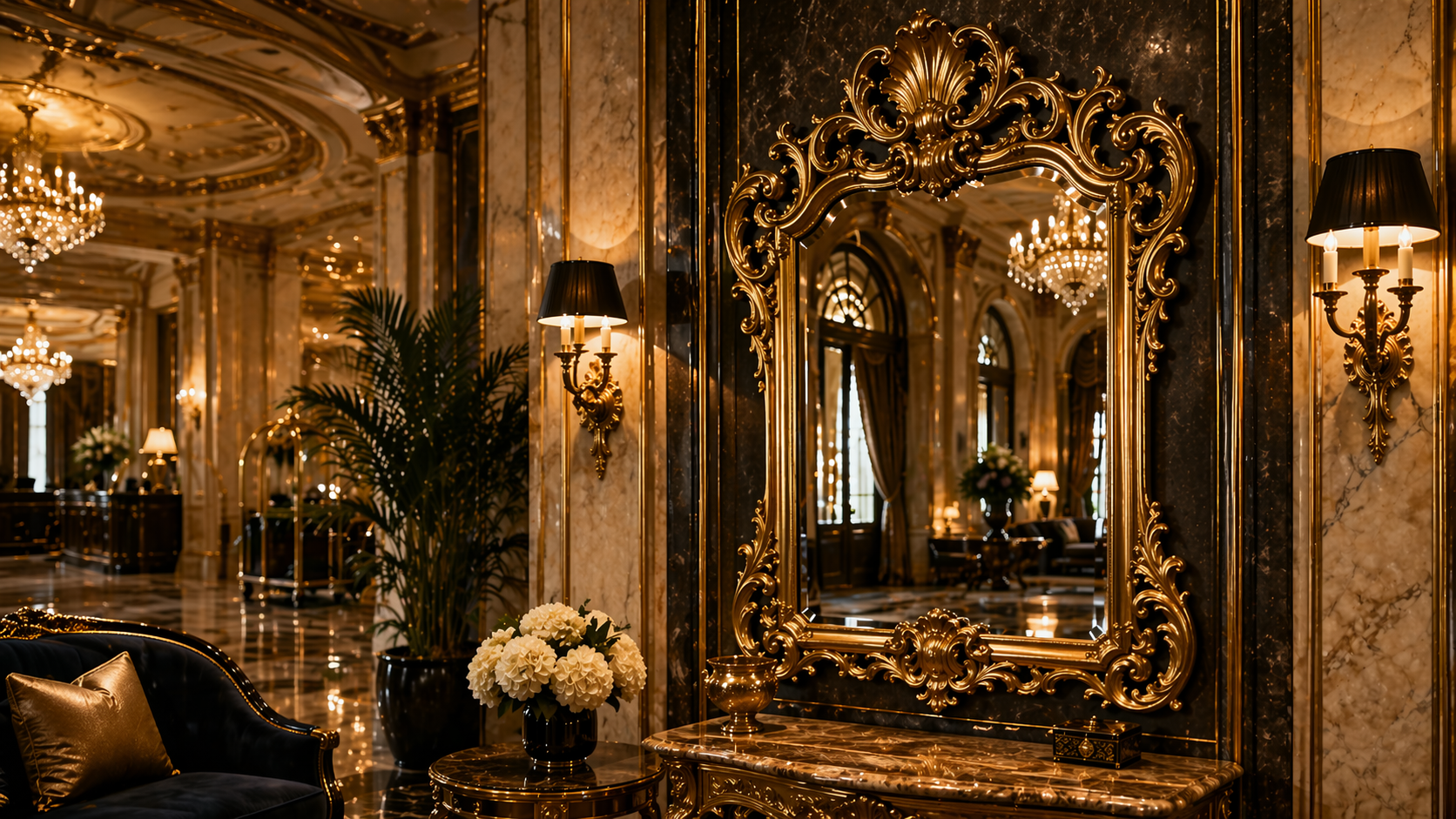
For a luxury hotel, a mirror is never just a functional object for checking one’s reflection. It is a portal to an era of opulence. Whether it’s a sprawling boutique hotel in the heart of Paris or a restored palazzo on the Venetian Grand Canal, the Baroque style mirror serves as the definitive anchor of luxury interior design.
The Art of First Impressions: Grandeur in the Lobby
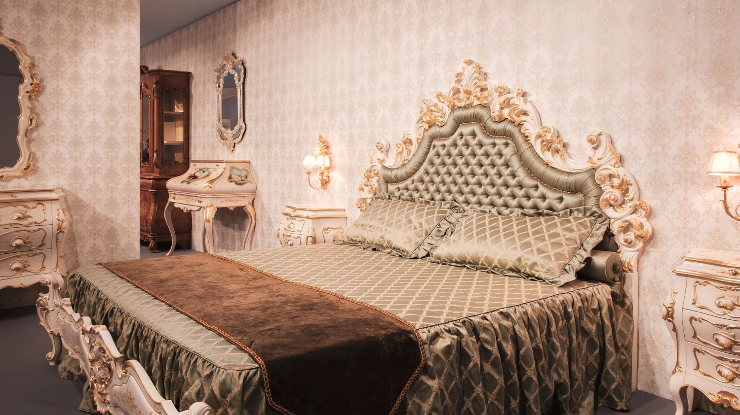
The lobby of a luxury hotel is its thesis statement. It’s where the guest transitions from the mundane world into a realm of curated excellence. A large, floor-to-ceiling Baroque style mirror—with its signature scrolling foliage, cherubs, and intricate gilding—commands immediate attention.
These mirrors do more than occupy space; they manipulate it. By utilizing a Baroque vintage mirror in a grand entrance, designers can:
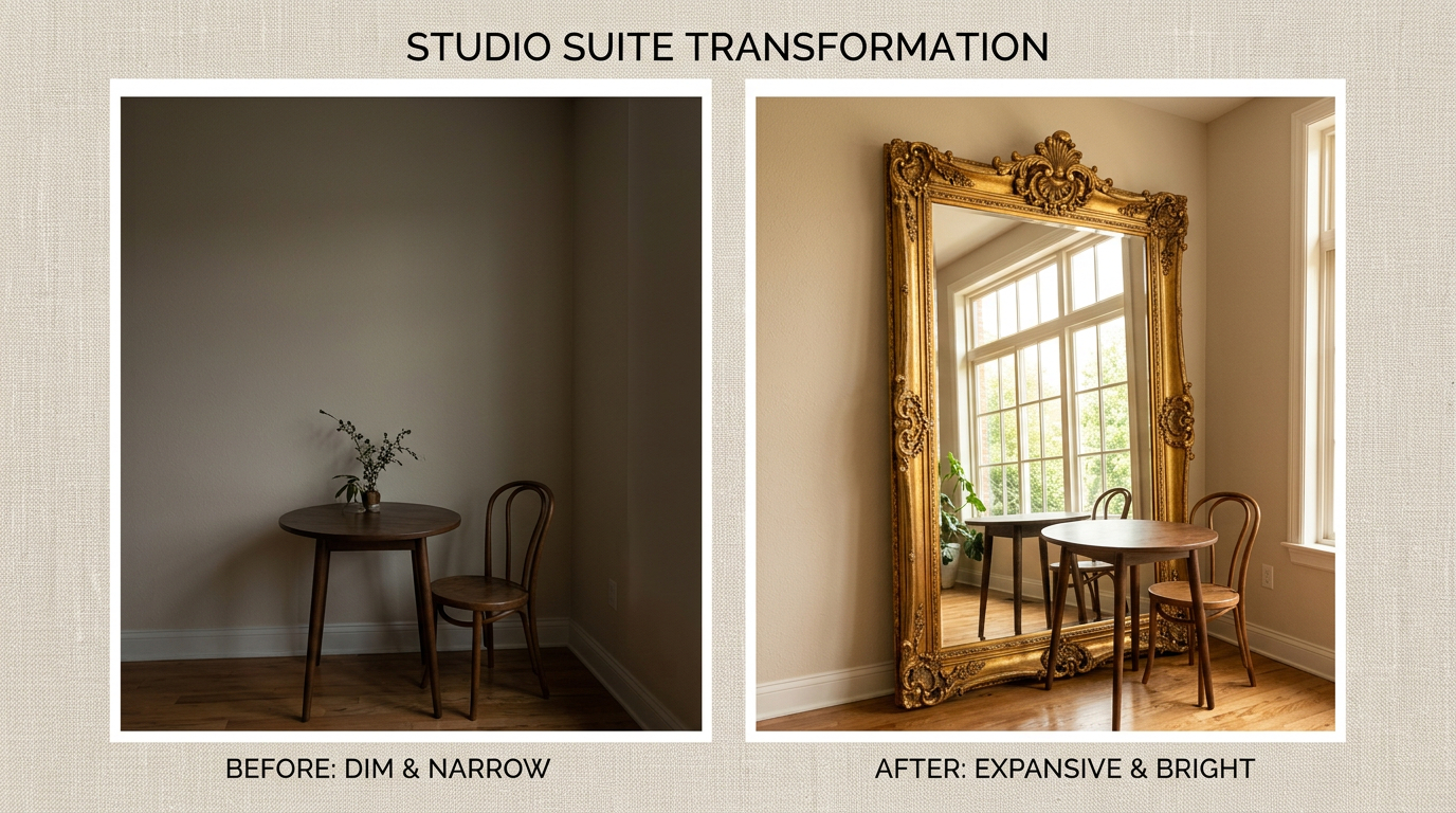
- Amplify Natural Light: The deep, ornate frames catch and refract light, brightening even the most cavernous halls.
- Create Visual Depth: In historic European buildings where space can sometimes be narrow, a strategically placed mirror provides an illusion of infinite luxury.
- Establish Authority: The sheer weight and craftsmanship of a Baroque frame signal to the guest that they are in a space of significant investment and historical appreciation.
Elevating the Guest Suite: The Private Sanctuary
While the lobby impresses, the guest suite must enchant. The modern luxury shopper—particularly those frequenting five-star establishments in London, Milan, or Vienna—expects a room that feels like a private place of royalty.
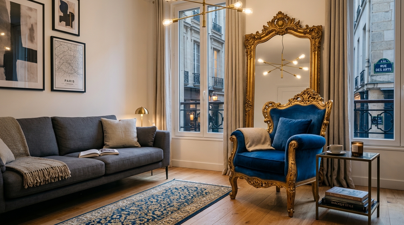
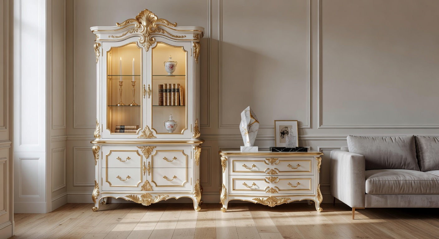
Integrating a Baroque style mirror into the suite design bridges the gap between modern comfort and classical beauty. A Baroque vintage mirror placed above a marble vanity or a mahogany desk transforms a standard piece of furniture into a focal point. It adds a layer of “lived-in” history, making the hotel feel less like a commercial space and more like a refined luxury home.
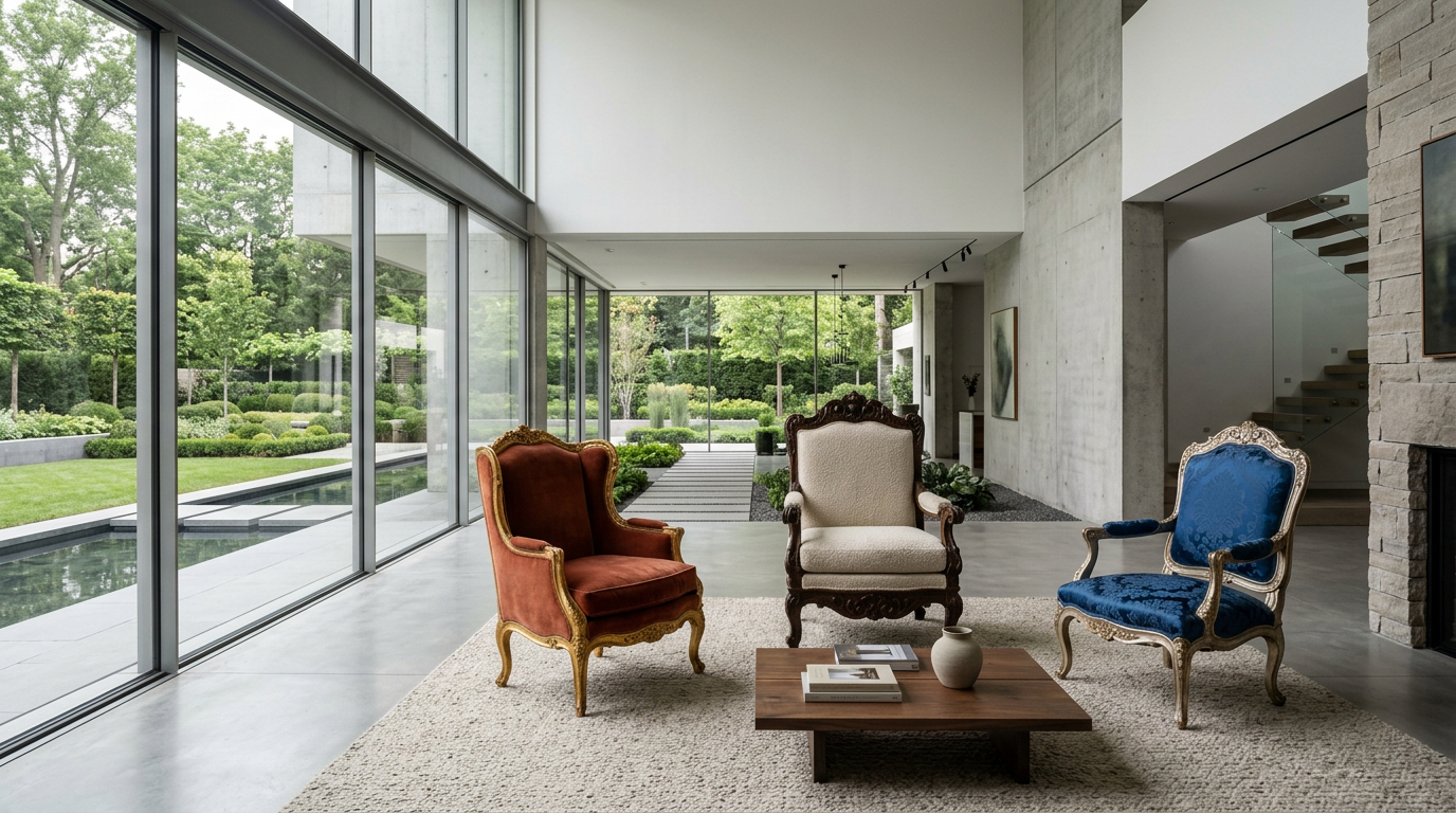
Design Tip: Pair a gold-leafed Baroque mirror with contemporary, sleek lighting. The contrast between the hyper-detailed carvings and the clean lines of modern fixtures creates a “New Classic” look that is currently trending across European design boutiques.
Why the “Baroque” Aesthetic Resonates with Luxury Shoppers
The term “Baroque” originates from the Portuguese barroco, meaning an irregular pearl. It is defined by movement, exuberance, and drama. For the luxury hospitality sector, this aesthetic is essential because it evokes an emotional response.
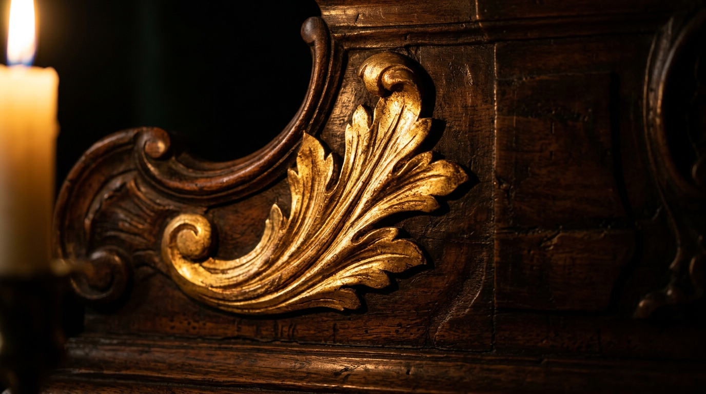
- Craftsmanship as a Status Symbol: In an age of mass production, the complex curves of a Baroque style mirror represent artisanal skill. Luxury guests value the “human touch” behind the decor.
- Timelessness: Trends like “Industrial Chic” or “Mid-Century Modern” fluctuate in popularity. However, the Baroque influence has remained a staple of European nobility for centuries. Investing in a Baroque vintage mirror ensures the hotel design remains relevant for decades.
- The “Instagrammable” Moment: Let’s be practical—modern luxury marketing relies on social media. The intricate frame of a Baroque style mirror provides the perfect backdrop for guest photos, turning every “mirror selfie” into a high-end advertisement for the hotel’s aesthetic.
Technical Integration: Beyond Aesthetics
From a development perspective, incorporating these mirrors requires an understanding of balance. To maintain an upscale feel without veering into “clutter,” designers should consider the following:
| Feature | Luxury Hotel Application | Private Place / Home Application |
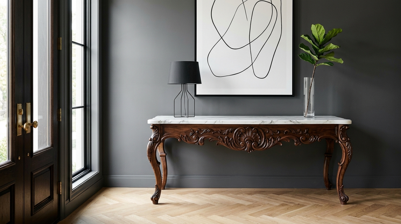
| Frame Material | Solid wood with gold or silver leafing for durability. | Aged brass or hand-painted resins for a bespoke feel. |
| Glass Quality | Beveled edges to add a diamond-like shimmer under hotel lighting. | Antique-foxed glass for an authentic “vintage” soul. |
| Placement | High-traffic areas (Lobbies, Elevator Banks). | Intimate settings (Bedrooms, Powder Rooms). |
Creating a Narrative of Opulence
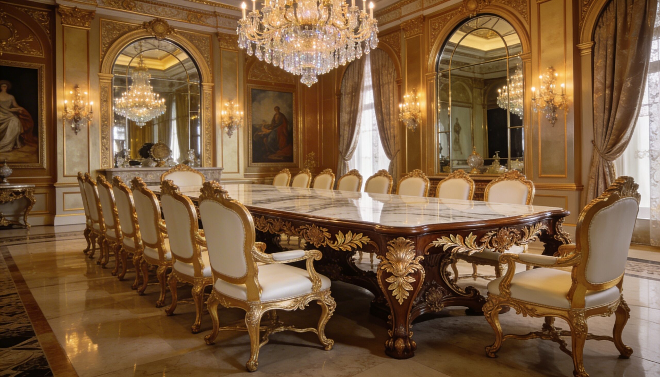
Luxury hotel design is about storytelling. When a guest sees a Baroque style mirror, they aren’t just looking at glass and wood; they are looking at a legacy. This style of mirror evokes the Hall of Mirrors in Versailles or the regal apartments of the Habsburgs.
For property developers and interior architects, choosing a Baroque vintage mirror is a strategic move. It fills the “visual void” that often haunts large rooms. Where a painting might require specific art knowledge to appreciate, a Baroque mirror is universally recognized as a symbol of wealth and sophisticated taste.
Conclusion: The Essential Finishing Touch
Whether you are designing a high-end luxury hotel, a secluded private place, or a grand luxury home, the mirror you choose dictates the room’s soul. The Baroque style mirror is not a mere accessory; it is an architectural tool that brings warmth, light, and a sense of history to a space.
By opting for a Baroque vintage mirror, you aren’t just decorating a wall—you are reflecting a standard of excellence that the world’s most discerning travelers have come to expect. In the realm of luxury, the reflection should always be as beautiful as the room itself.